It's nice to get out of the house to get some remote work done. Remote Rover makes it easier to find the right (free) location.
Remote Rover simplifies the search for remote work-friendly spaces by providing a curated, searchable map that displays all work-friendly public locations — not just "cafes with wifi."
Searching "coffee shops with wifi" on Google Maps turns up many clearly work-friendly cafes, but these results are often inaccurate. Users also tend to overlook non-cafes that are just as work-friendly, like food courts, libraries, and hotel lobbies.
Remote Rover simplifies the search for remote work-friendly spaces by providing a curated, searchable map that displays all work-friendly public locations, not just "cafes with wifi." Results are more accurate than Google Maps because users can suggest and take down locations of their choice.
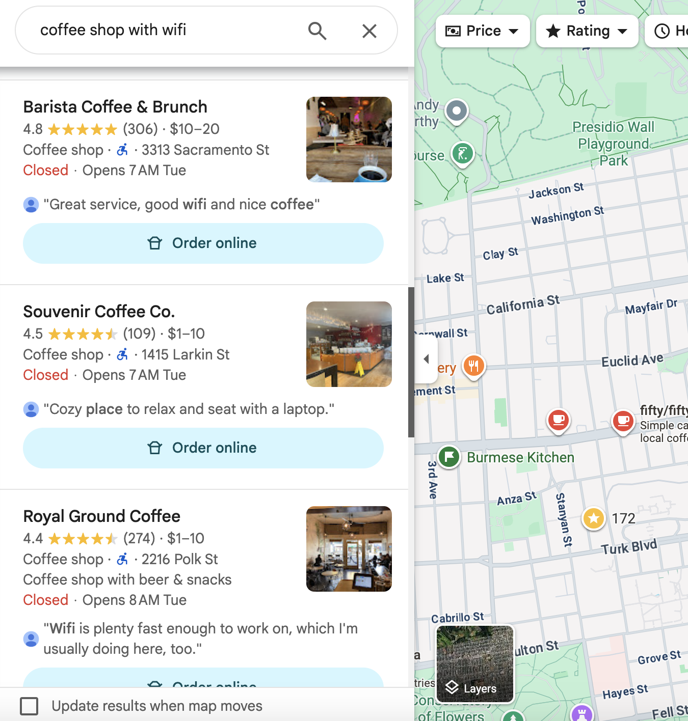
These are my search results for "coffee shop with wifi" in San Francisco. I can confirm they're accurate.
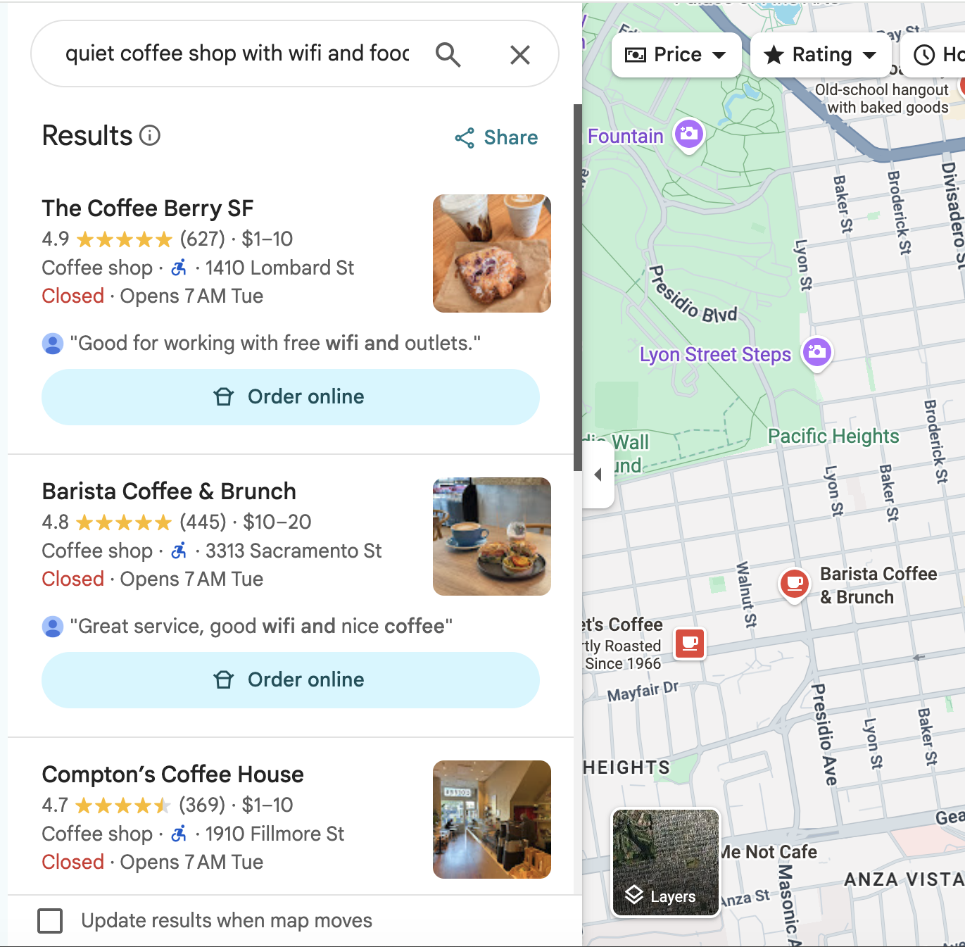
Searching "quiet coffee shop with wifi and food" also turned up mostly accurate results.
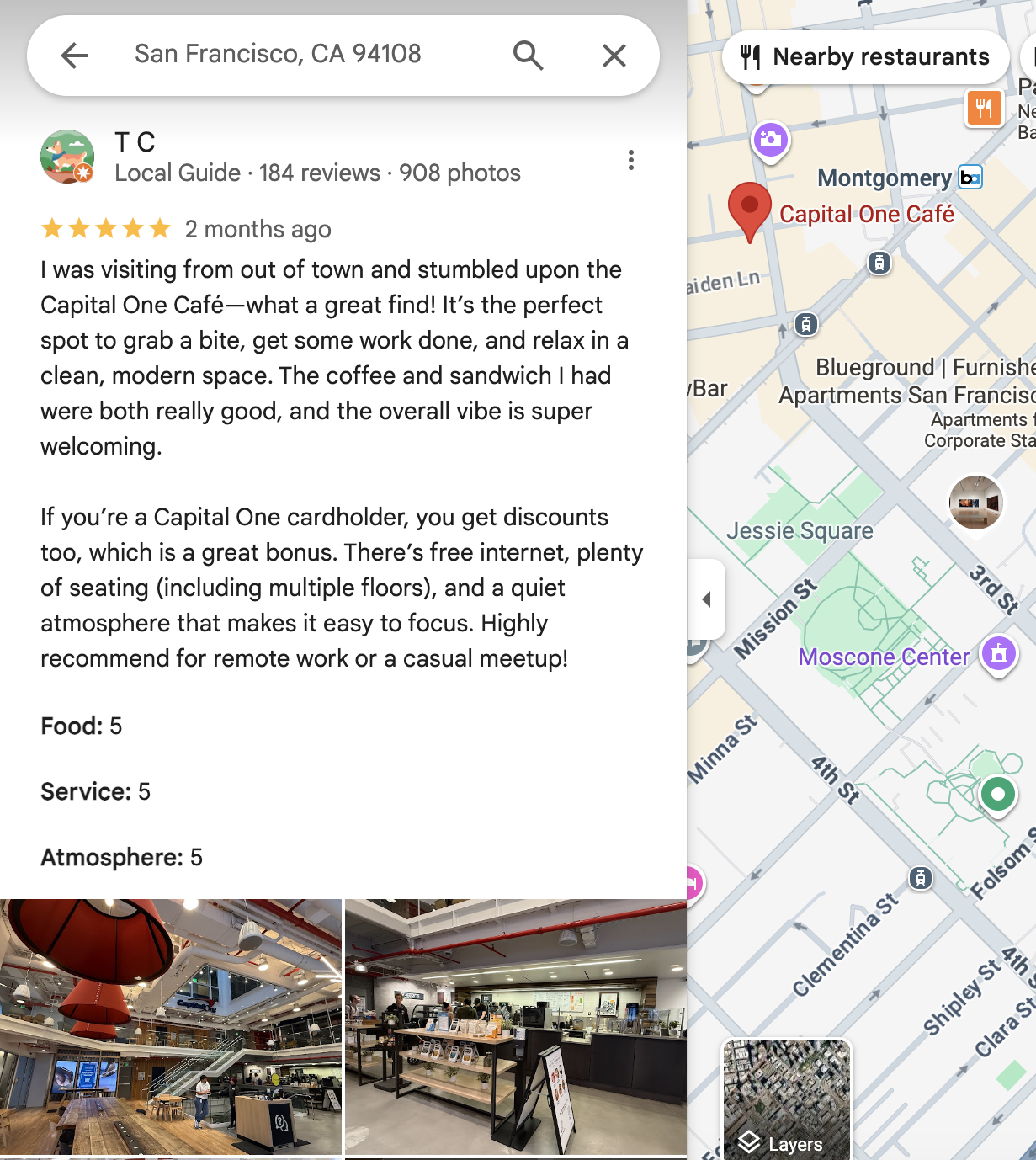
The review snippet makes a major positive impact on usability by providing clear, immediate verification that at least one user finds the space work-friendly.
That should make it easy to find a space, right?
😫 It's after 5pm and hardly any coffee shops are open.
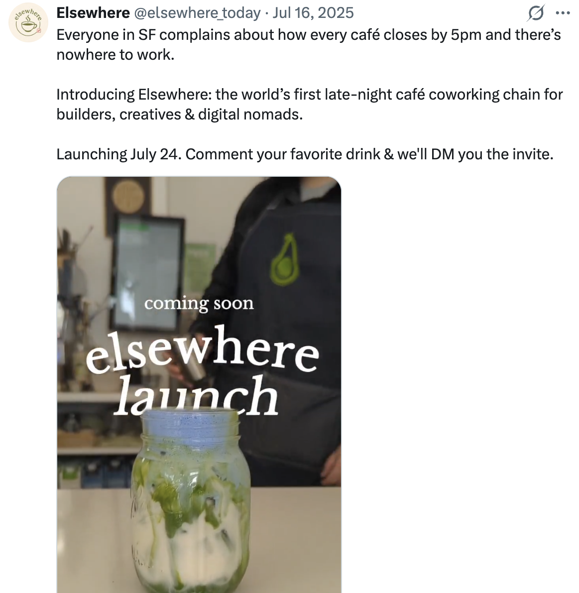
😬 All the coffee shops around you with wifi are too crowded.
😱 You picked an invalid result and now you're at a loud sports bar with a Zoom meeting in 2 minutes 💀
Because Google Maps isn't tailored to remote workspaces, you can't improve these results by reporting them — you can only write a frustrated review, which takes quite a bit of cognitive load. If only there was a more convenient, simpler way to refine these search results.
⭐️ Saluhall is one of my favorite remote workspaces in San Francisco, but because it's a food court, it won't show up if you search "cafes with wifi" — or even "places with wifi." 😠 That means users are missing out on a desirable option, and 🕘 it's open until 8pm, later than the vast majority of nearby cafes, making it a great fallback after 5pm.
😬 Searching "coffee shops with wifi" in San Jose has also turned up far more inaccurate results than in San Francisco. ⏰ Navigating to invalid locations wastes users' time, and traumatized users might feel compelled to spend extra time verifying future results.
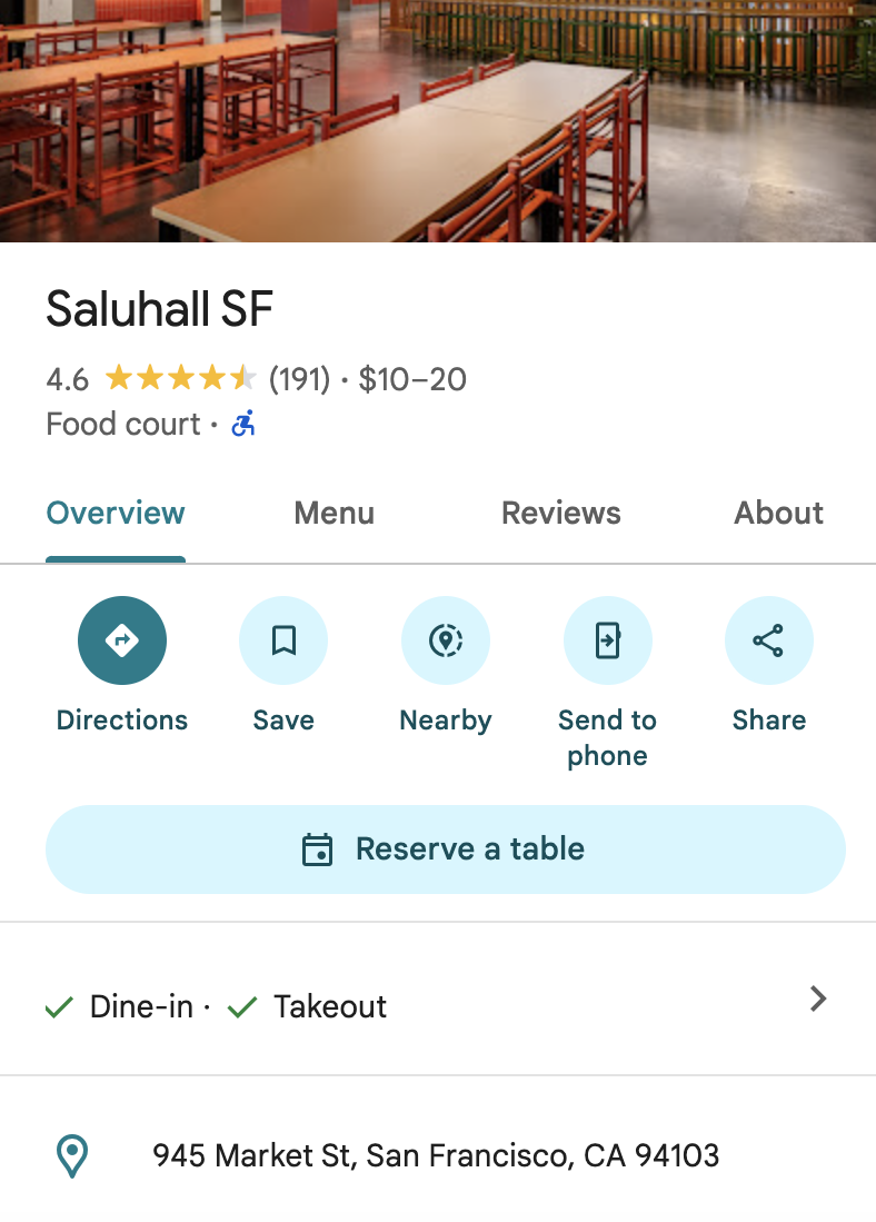
Saluhall: a food court that won't turn up in a "cafes with wifi" search, despite being open until 8pm with plenty of seating.
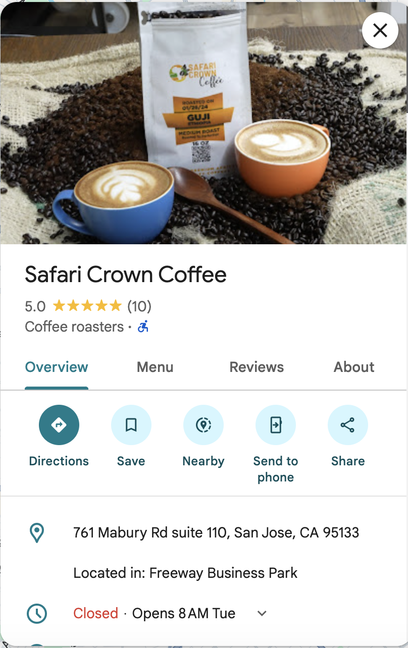
Safari Crown Coffee: Not a cafe! This is a manufacturer.
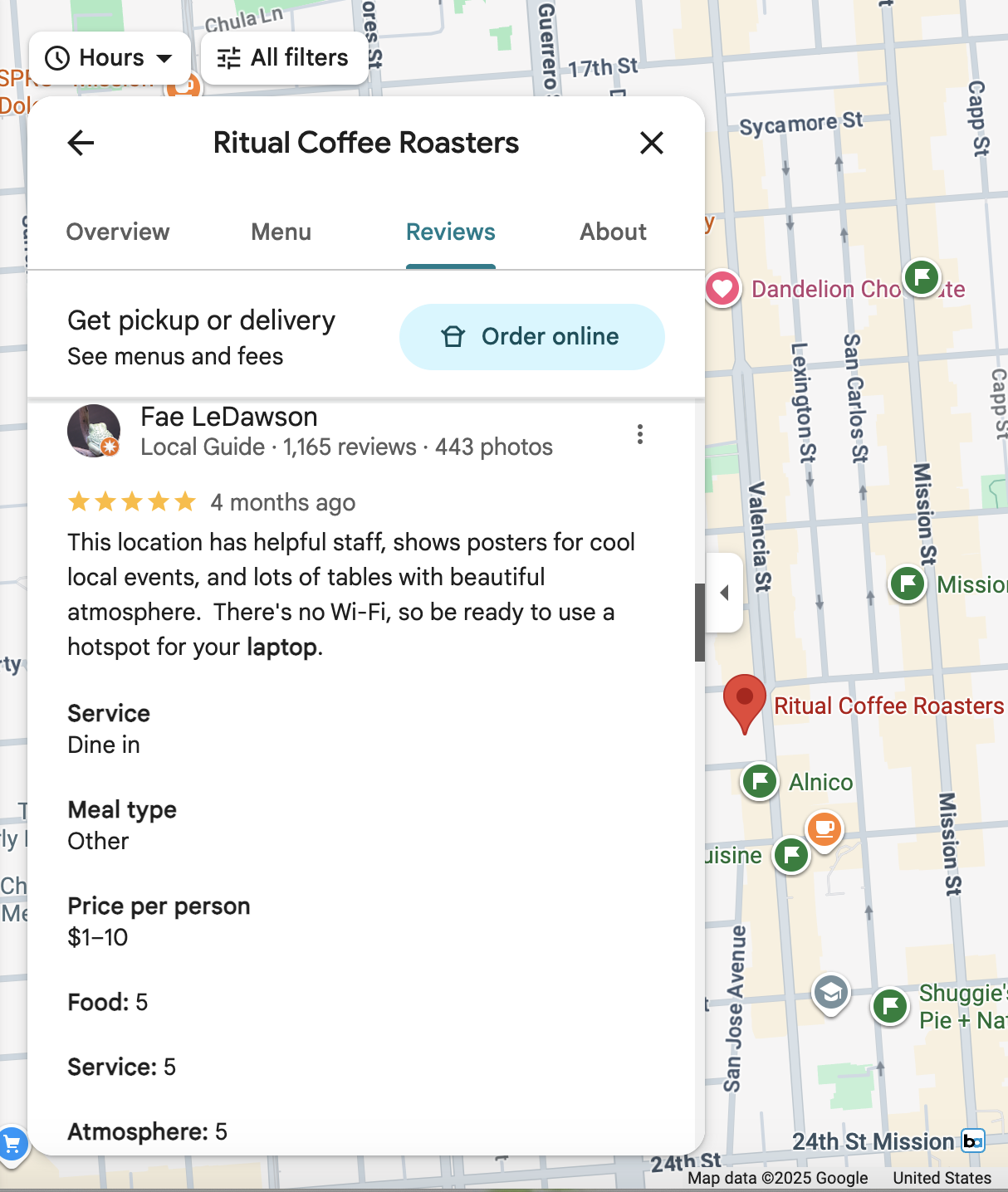
Ritual Coffee Roasters: no wifi! You can still work there, but you won't know about the lack of wifi until digging into the reviews.
⚠️ Note: these evaluations can't fully replace user research. I couldn't find much information on usability issues other users have had with these sites, so I'm currently filling in that gap with my own user testing.
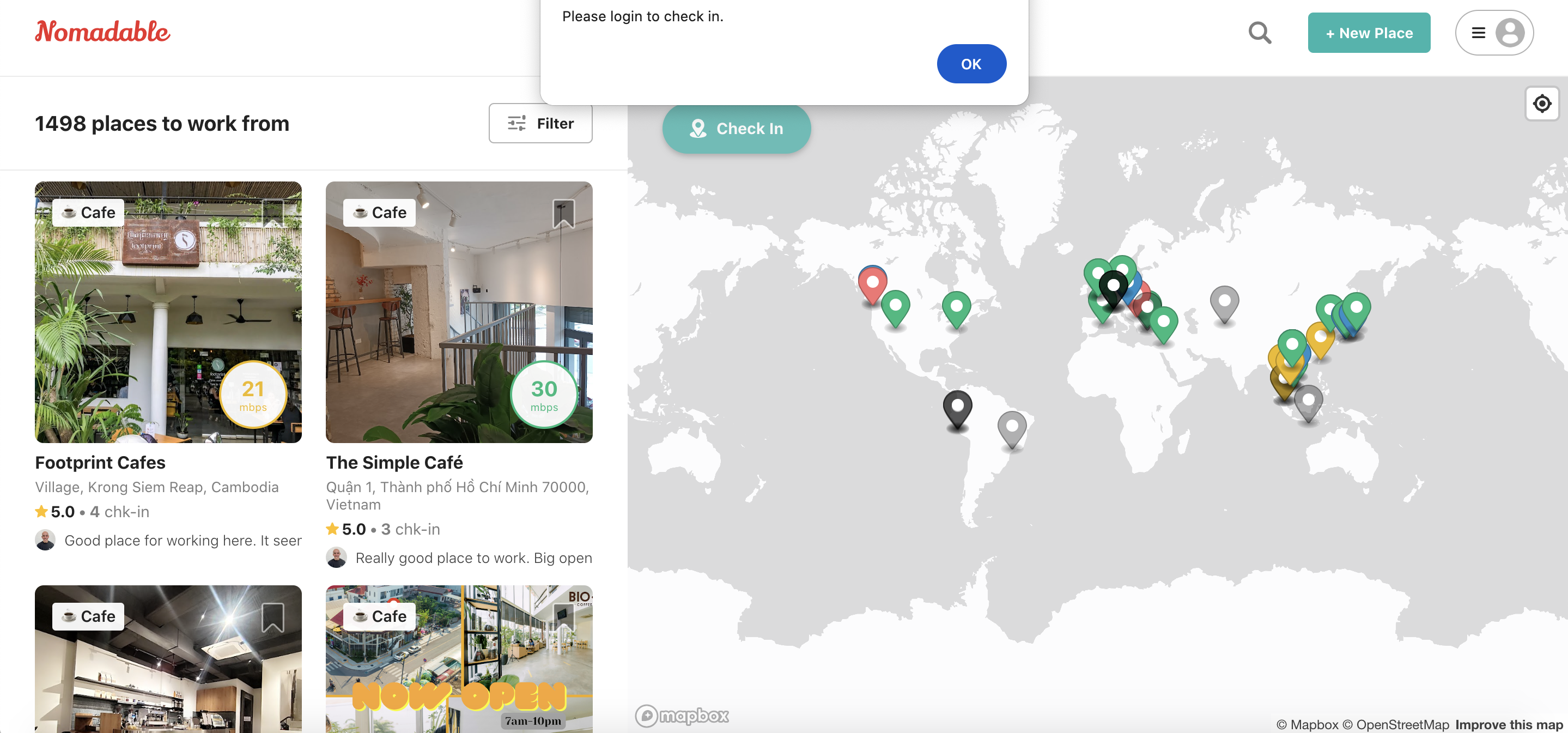
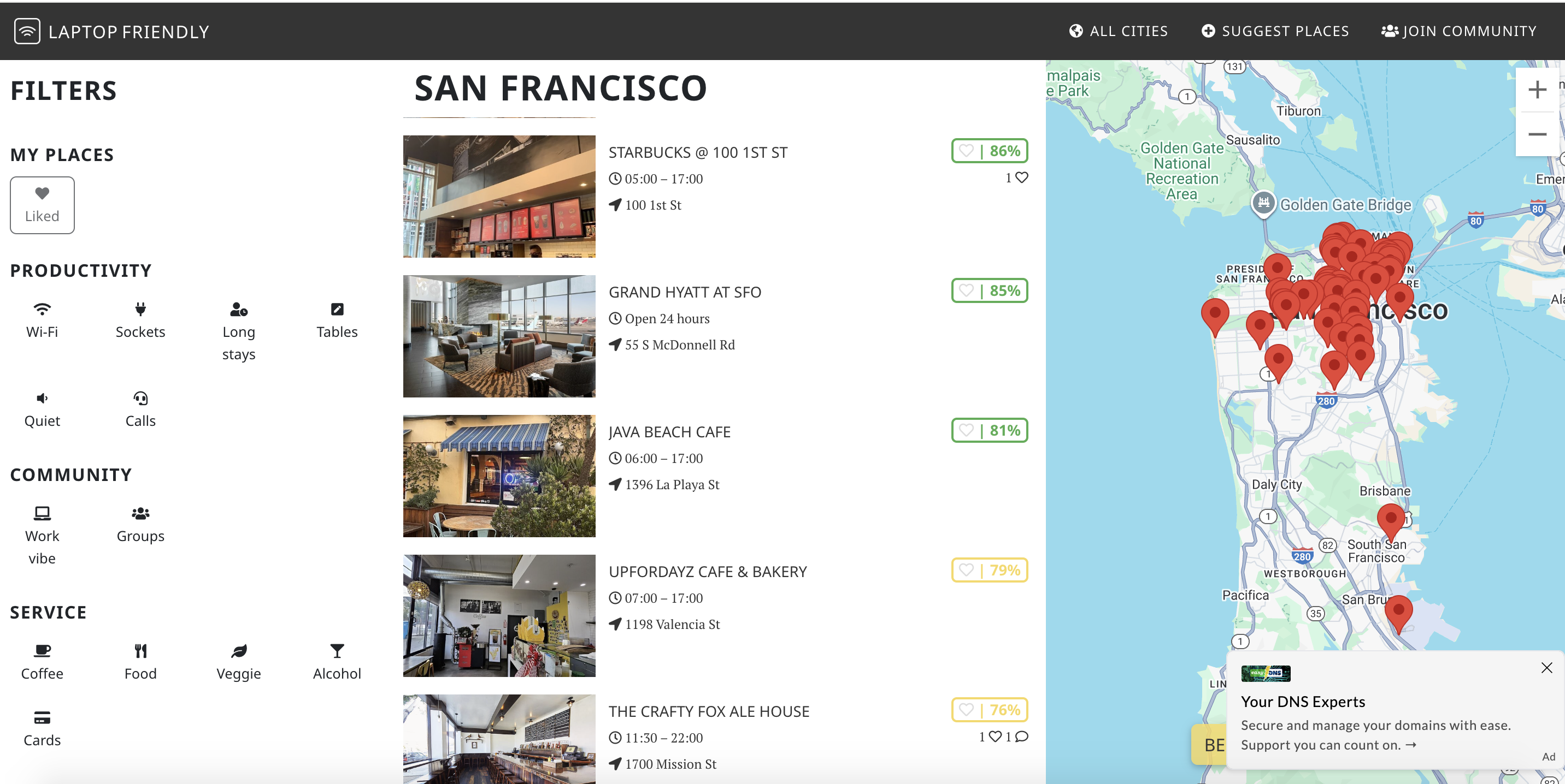
To determine which features to implement beyond what the competitors above already offer, I researched typical remote worker needs and concerns through discussion forums, articles, and Google Maps and Yelp reviews of popular and underrated work-friendly locations.
Creating user personas helped me categorize the needs surfaced by that research.
⚠️ Accounting for possible bias: as someone who's worked remotely for years all over the world, I've been both of these personas myself, which may influence my perspective.
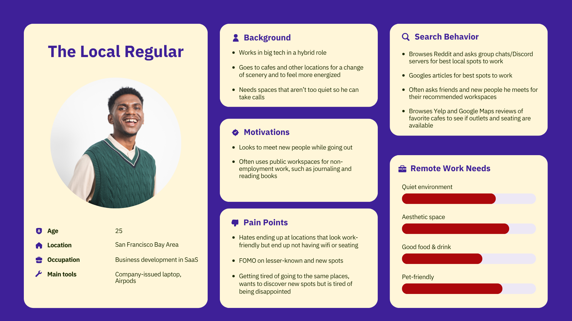
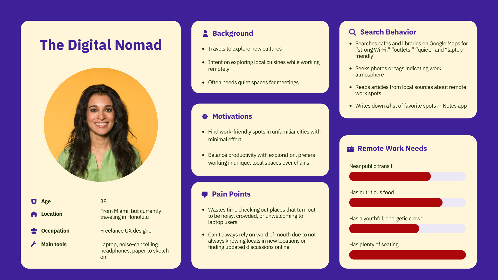
I designed each screen in Figma and brought it to life with the AI vibe-coding tool Lovable. The bulk of the code is AI-generated from my prompts and Figma files, but some of it is manually written by me.
✅ More features will be added after substantial usability testing.
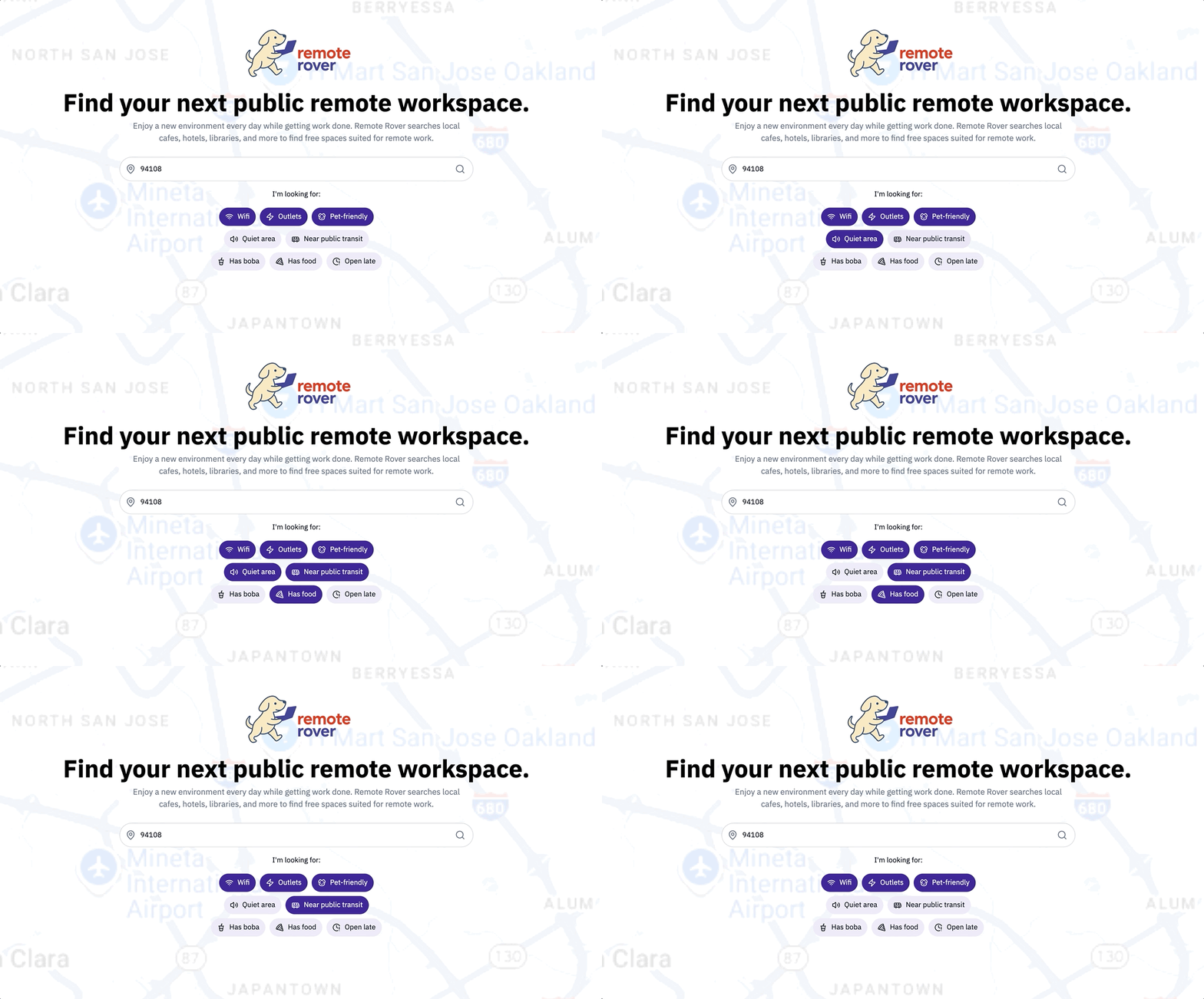
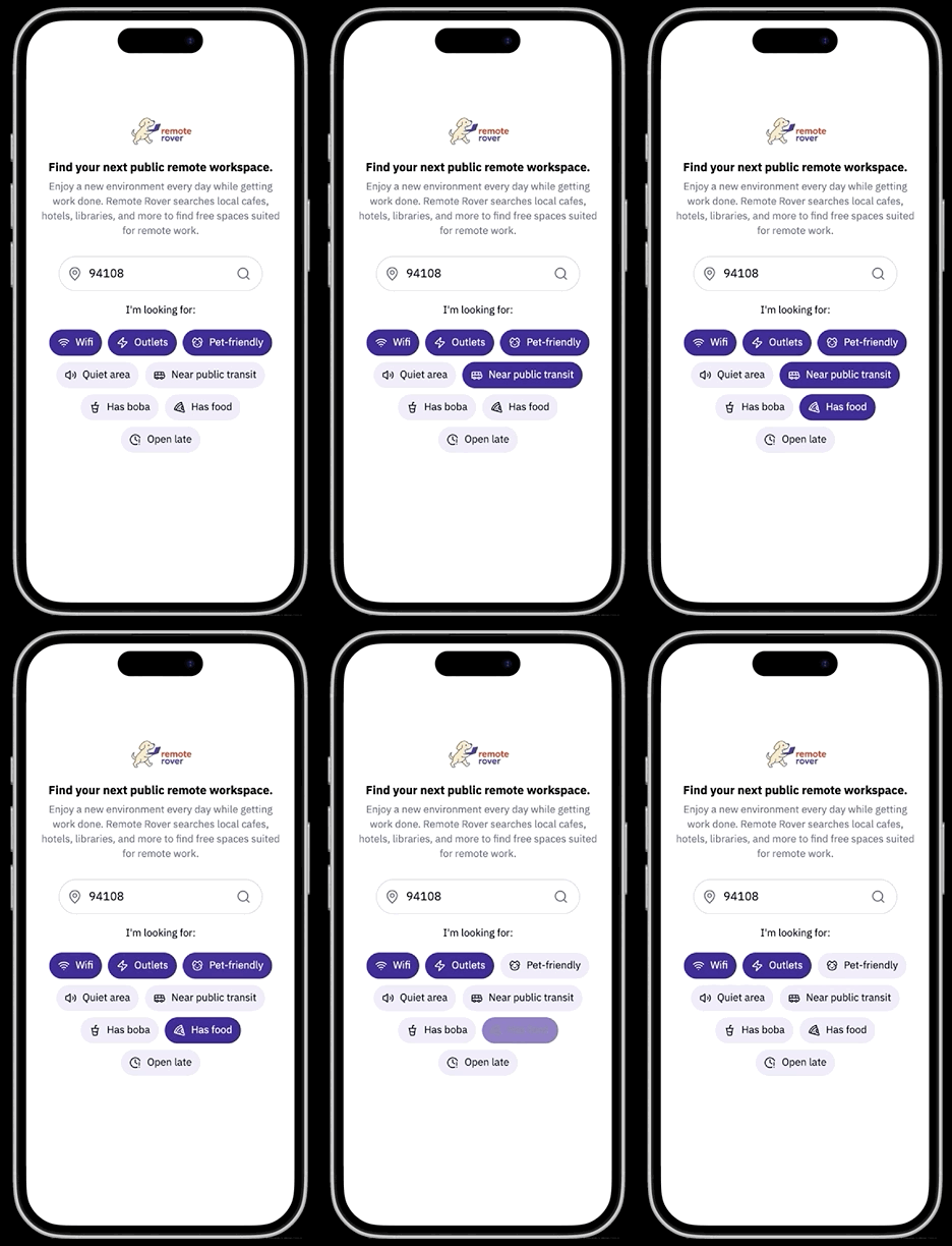
It seemed most efficient for users to be able to search for a location right away upon opening the site — reducing friction compared to the user flows of the competitors above, with no need to log in. Like on Google, the screen asks the user for permission to detect and autofill in their current ZIP, minimizing the time between landing on the site and viewing results.
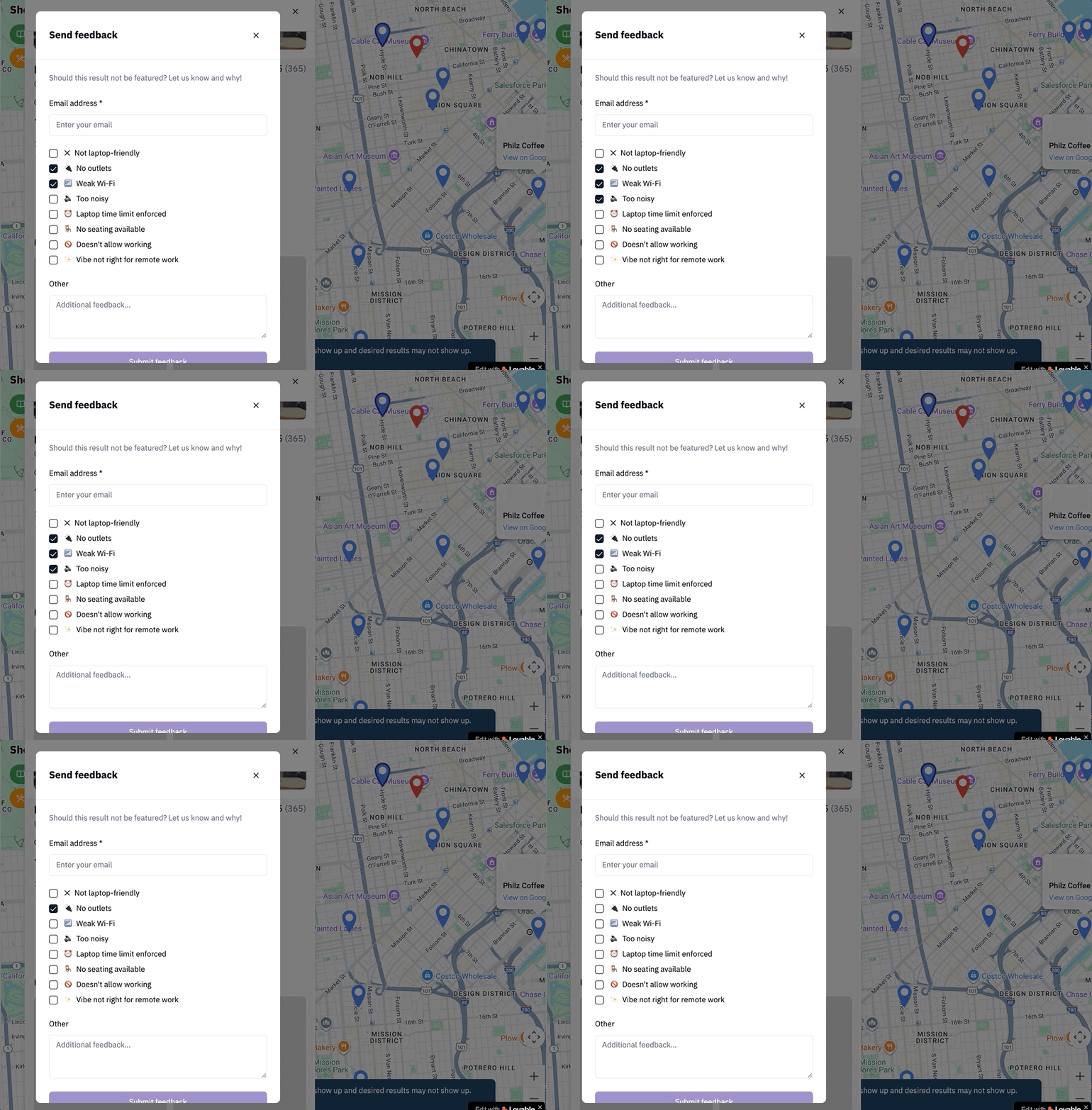
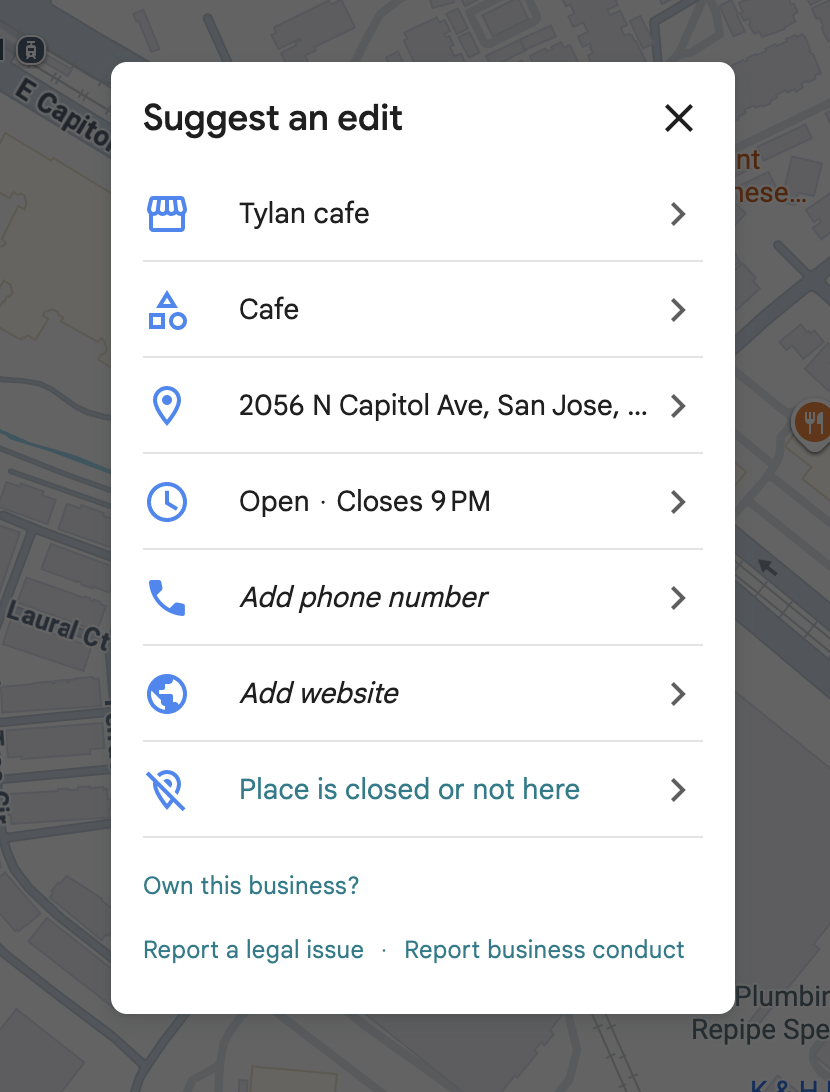
Google Maps' algorithms and generative AI won't always be 100% accurate, so users are encouraged to take down inappropriate locations — accounting for technical gaps, improving result validity, and preventing users from wasting time manually verifying or navigating to the wrong location.
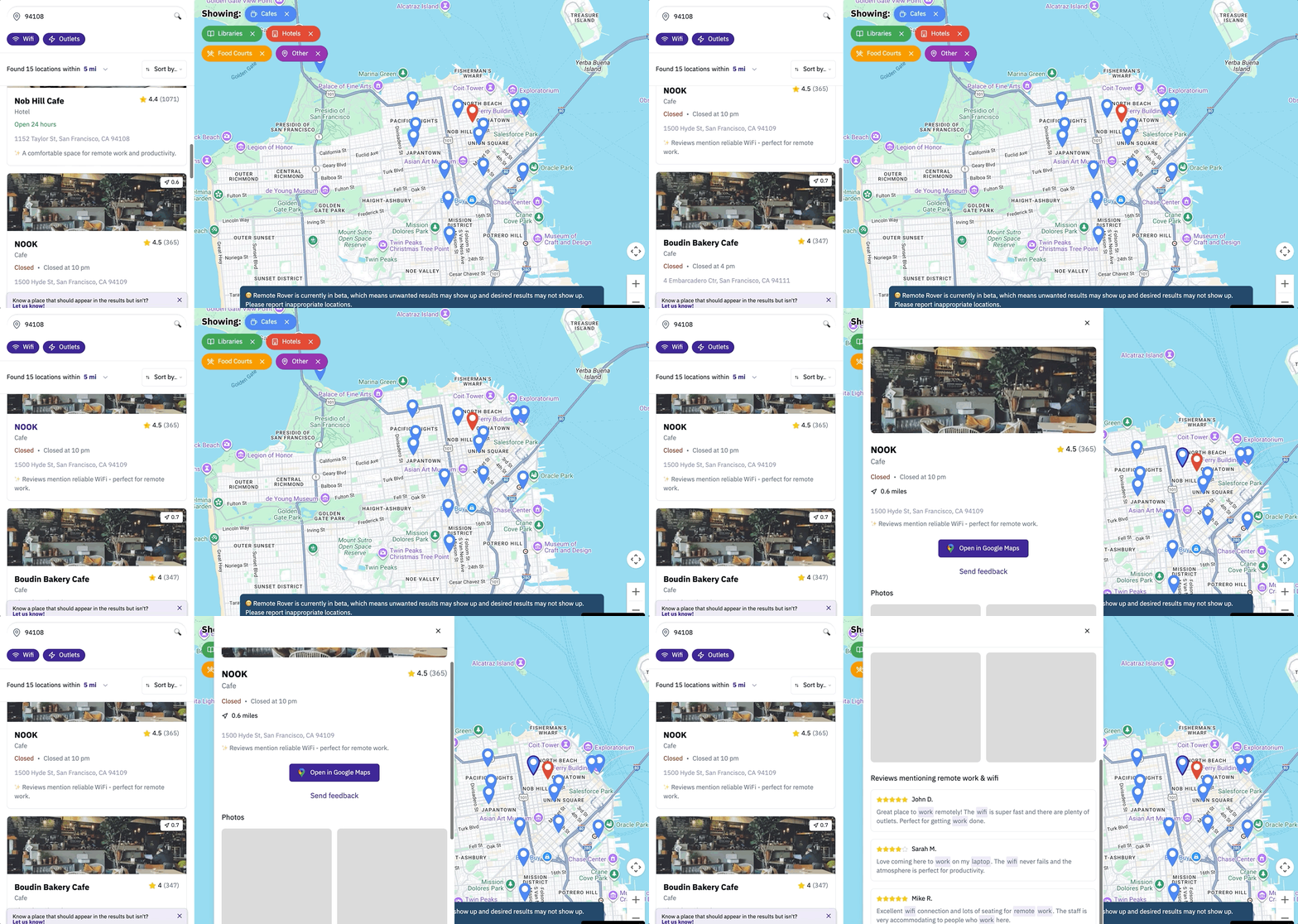
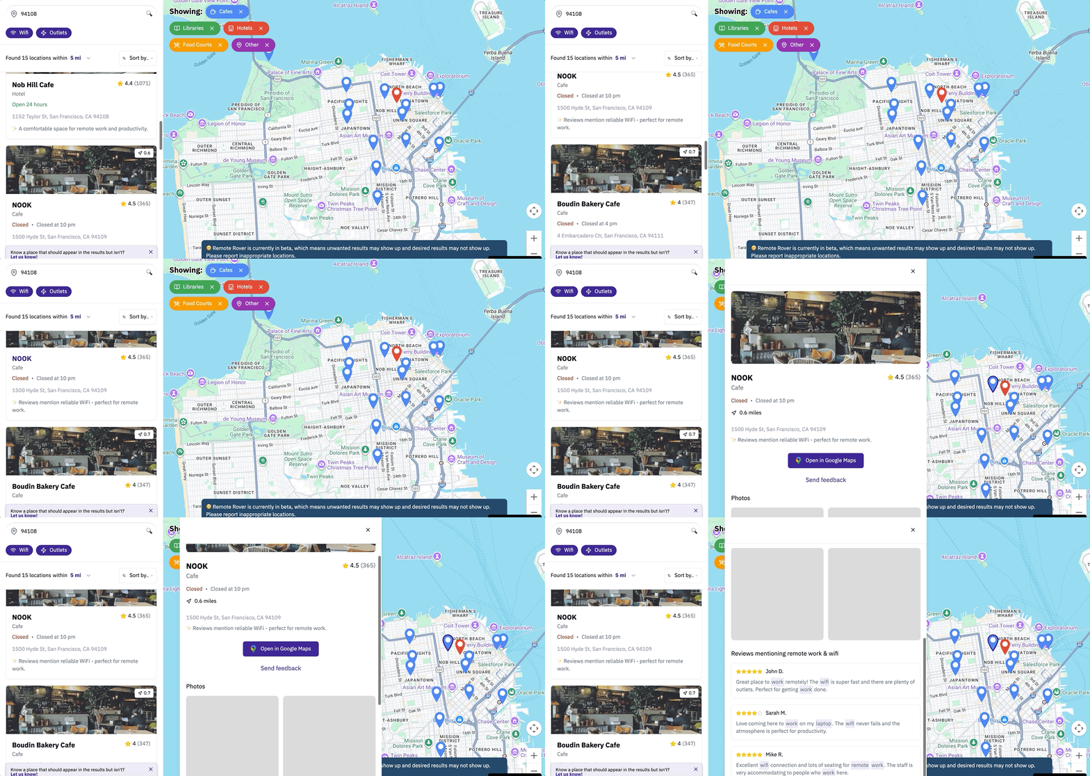
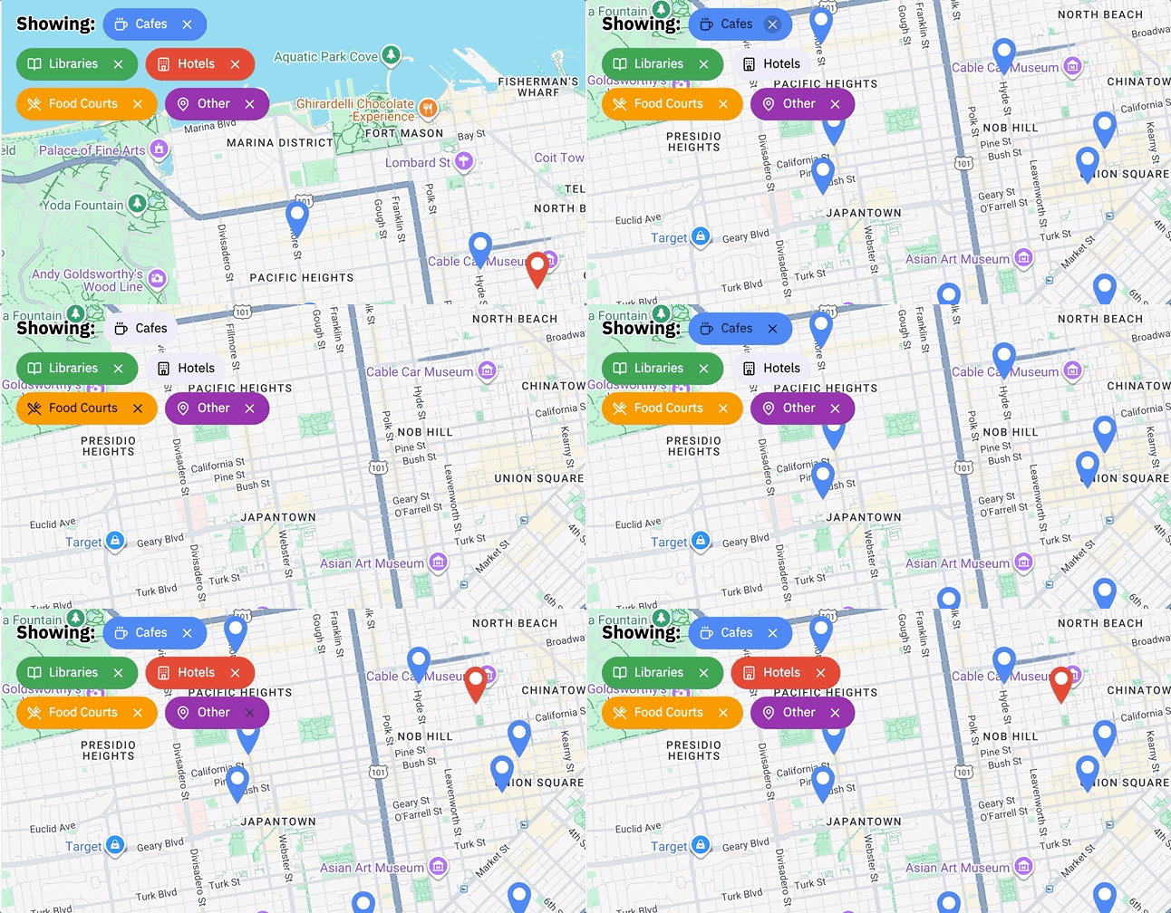
Some users may only be in the mood for certain types of work-friendly spaces, like food courts or libraries. They can remove unwanted categories by clearing each tag to refine results while still maintaining multiple location types. Each map pin's color matches the color of its tag for coordination, and users can open each location on Google Maps to view full details and navigate there.
⚠️ Note: the photos and AI summaries are currently placeholders to limit data costs, since location data is being requested from Yelp and Google Maps.
The search results and location details panels are inspired by the design of Google Maps. Each location has an AI-generated summary derived from its Google Maps or Yelp reviews, summarizing how work-friendly the location is to give users immediate verification without manually searching through reviews. The photo section provides additional verification by pulling photos of customers working at the location, falling back to photos of the seating area if work photos aren't available.
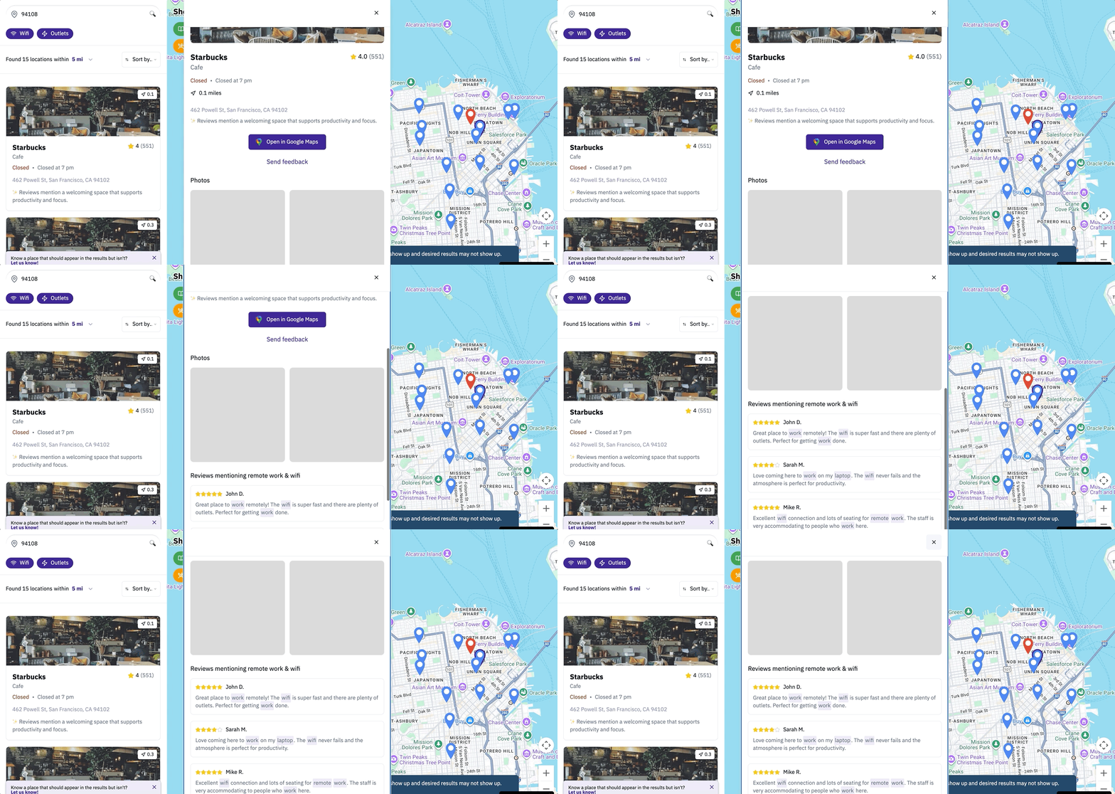
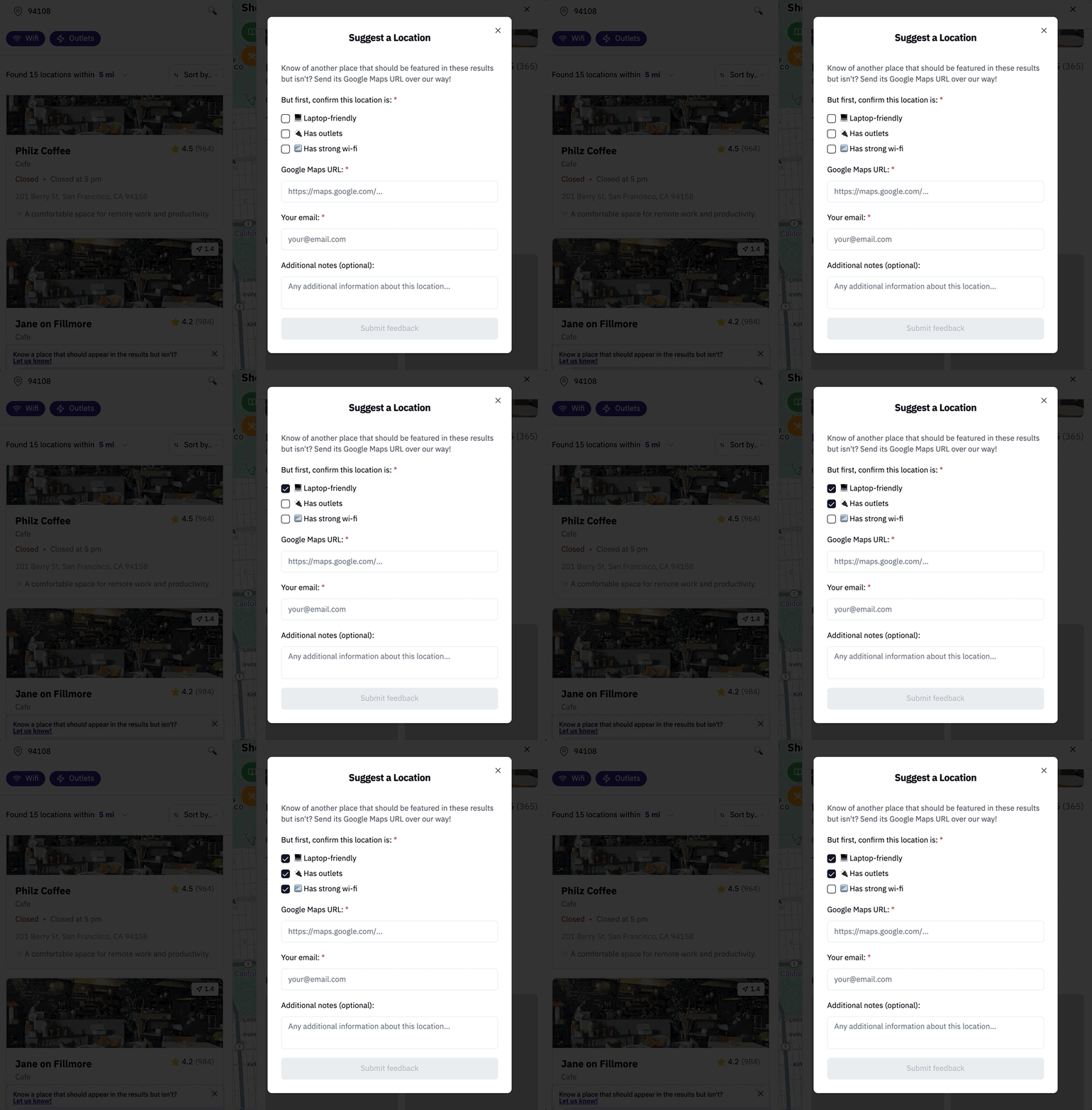
To account for locations the algorithm may be erroneously skipping, users always see a dismissible floating banner inviting them to submit a location, and must confirm the submission has characteristics that make it work-friendly. This makes lesser-known and brand-new spaces — which may lack reviews — much more discoverable than on Google Maps.
⚠️ I sadly couldn't figure out how to code this function, so I'm using demo text for now.
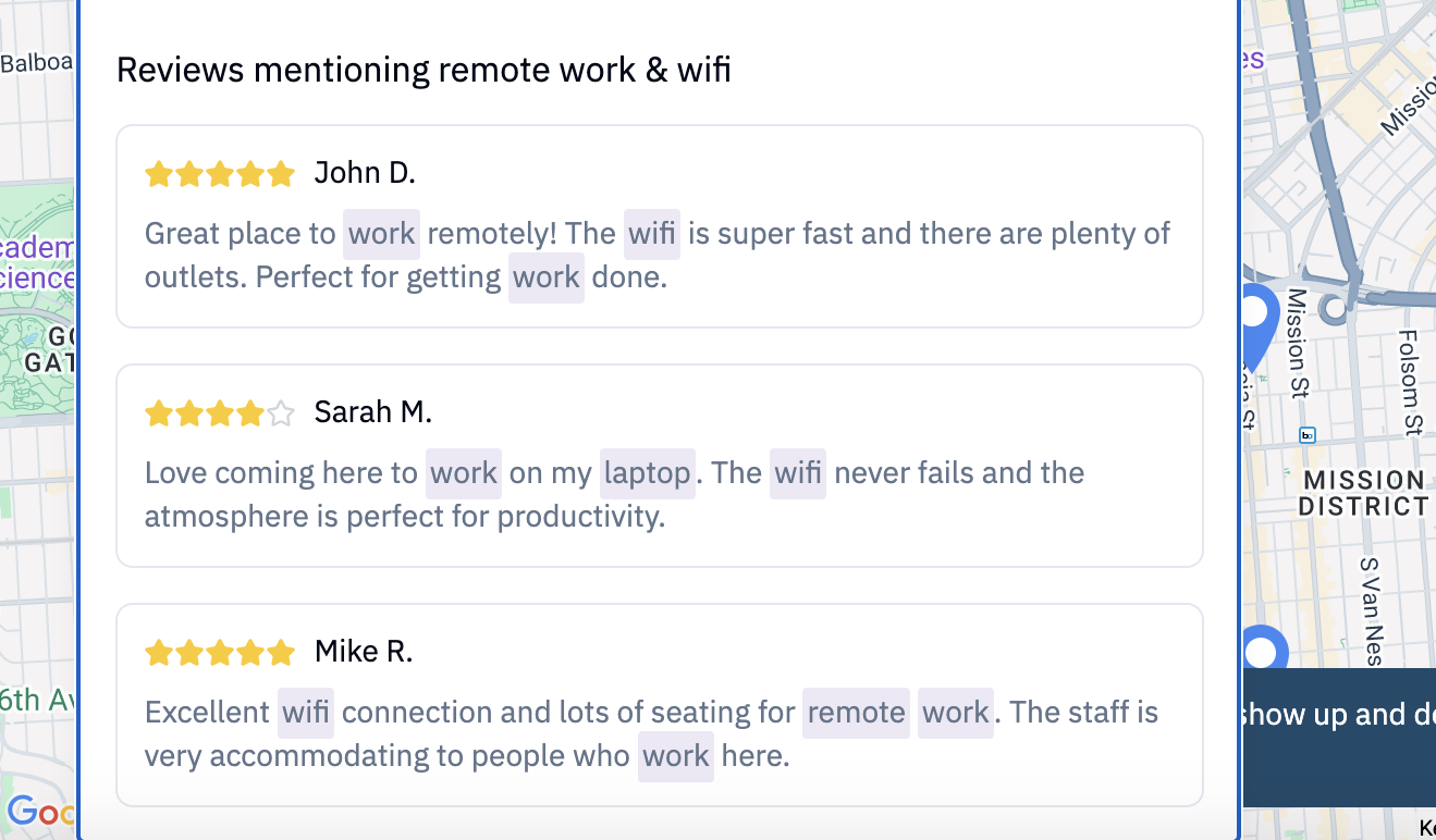
Knowing that not everyone trusts generative AI's accuracy, each location uses APIs and an algorithm to display selected reviews from Google Maps and Yelp, pulled from users specifically saying it's work-friendly.
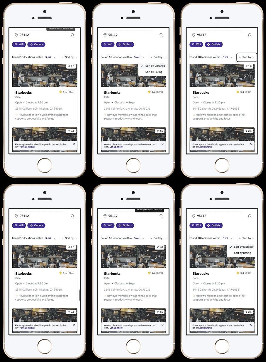
It seems likely that users will most often search for workspaces on mobile, waiting until they actually arrive to pull out a desktop. The original Figma designs were actually mobile-only — I later adapted the code for desktop.
I'm currently recruiting a diverse range of participants who often work remotely in public, including students, remote workers, entrepreneurs, and unemployed jobseekers. Testing takes the form of a survey followed by moderated sessions.
In order to proceed with human-centered design, I won't build out more complex features until I gain more insight from user needs.